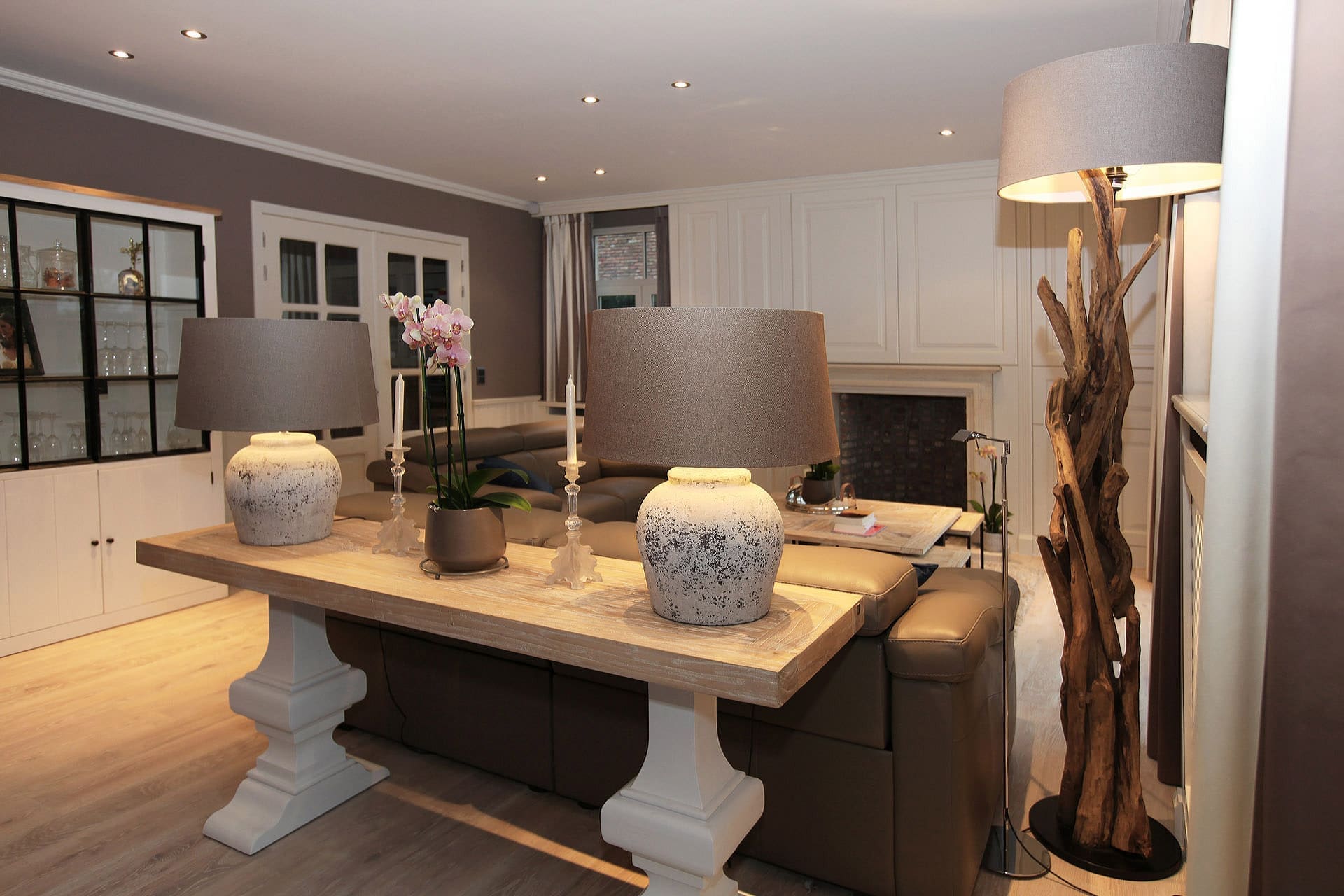
Bringing everything into harmony and carefully executing the meaningful details was the message. This villa was decorated through the years no with all kinds of furniture, carpets and other objects brought together. The parquet floor was dark and needed some renewal and rejuvenation.
The curtains had once been replaced, but no harmony was ever considered. The chandelier over the dining area was now centered just opposite the dining table and the double door. The salon has now gained a streamlined perspective. The coffee table has a solid wood top in Elm. The small side tables are playfully placed under the large central table. This not only looks tidy and beautiful, but also very practical.
When composing the colors, the taupe was chosen interrupted by light white tones.
Marcottestyle thus sought to harmonize all volumes, colors and perspectives. The teracota lamps were also matched to the whole. All these important details are in the most effective balance with the incoming light and shadows. These are as many points of interest that Marcottestyle always takes into account. Marcottestyle can rely on a lot of experience with these kinds of total projects. Thanks to the appropriate advice and knowledge, a total project always results in a flawless execution of the plans.
The office only received new curtains and the old cabinet and desk was sandblasted and then oiled white. For optimal protection, the wood then also chalked up two more coats of matte varnish.
Against the long wall around the fireplace, a perfectly proportioned white wooden salon cabinet was created. In the middle, above the fireplace hides the Tv. Surprising are the curtains in a very soft noble fabric, the colors of which are completely reflected in the walls and white cabinets. This creates continuity and curtains and walls become one.
From the somewhat somber and sad bedroom, a small intervention gave a sense of tasteful unity with thoughtful finesse. Here, taupe gray and beige tones throughout the bedspread, curtains and walls play a dominant role without being really intrusive. The ensemble gives a very calm feeling.
The small bathroom suddenly became a bit larger due to a complete rearrangement. This effect comes from setting up the large walk-in shower centrally and placing the two sinks against the wall of the shower. This also gives space to place low custom cabinets against the long wall. The radiator now disappears aesthetically between the two custom cabinets and form a single unit.
To form an idea of the metamorphosis, it is worth taking a moment to look at the picture of “before and after.” After this, you will soon be convinced.

