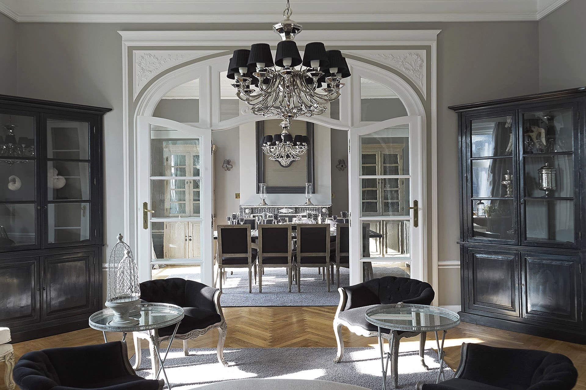
This is always without striking bling-bling.
The soft colors where everything fits together are repeated in all rooms.
We always play with some colors with similar but different nuances.
The combination of styles always remains sober. Glossy objects reminiscent of glitz and glamour of Hollywood certainly do not appear here. The visitor and even the resident here is still more impressed by the subtle taste of harmony and gets a sense of tranquility.
However, the interior architect here did want to give an innovative aspect to an ancient interior and has made the explicit link between the present and past that becomes a fascinating story. The building dates from 1920 and this should be honored.
Our client is someone who loves our style and finds the overall concept attractive. Instead of buying a piece of furniture or carpet here and there and putting a lick of paint on the wall, a total interior is proposed that is completely in harmony. This allows one to really feel at home in an interior that has appeared several interior design magazines and books.
The kitchen has become a modern version of an old castle kitchen. The horizontal wooden planks make it a bit sleeker. There is also reminiscent of a polished natural stone walls.
In fact, most of our complete interiors are shown in a magazine. This way the line is continued in the entire home. Here and there between the retro style a little tighter tone gives a different shape to the interior; a little younger and fresher but always with a certain class.
One bathroom we kept completely still in retro style, against which another bathroom was designed hyper modern. A bathroom, by the way, is always a completely different space that can safely be somewhat modern.
A complete furnishing of an old mansion is no sinecure, as many old elements must be preserved and the interior decorator must always create something special while maintaining warm atmospheric living spaces where class and coziness find themselves.
Check out all our press articles and relax in our creations!

